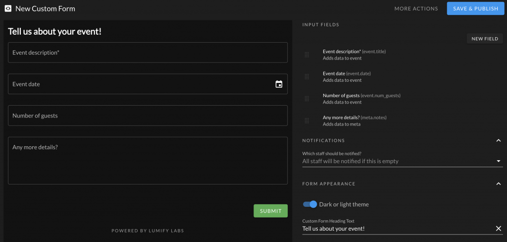
The contact form widget allows you to receive targeted prospects that pre-populate event, contact, and other data into Lumify. There are a number of customizations you can make to the form.

Available Field Types
You can choose from a variety of field types for your contact form. Here’s a quick summary of the available fields that link to attributes in Lumify:
- Events (creates a new event)
- Title
- Date
- Type (loads from your event types)
- Guest Count
- Contacts (creates new or updates existing contact)
- Name
- Phone
- City
- Additional Fields (included in notification email and added to event meta)
- Text Field
- Text Box
Customizations
You can customize the contact form widget:
- Input Fields: The form fields that appear on the form. Drag and drop these. Use the “New Field” button to add new fields from the wizard.
- Notifications: Choose staff should be notified of new submissions. If no staff are selected, all staff will be notified.
- Dark or Light Theme: Adjust the appearance to match your branding.
- Heading Text: The heading shown at the top of the contact form. This can be blank.
- Success Message: The message that is shown to clients when the message has been sent.
- Submit Button: The text shown in the submit button.
Basic Widget Use
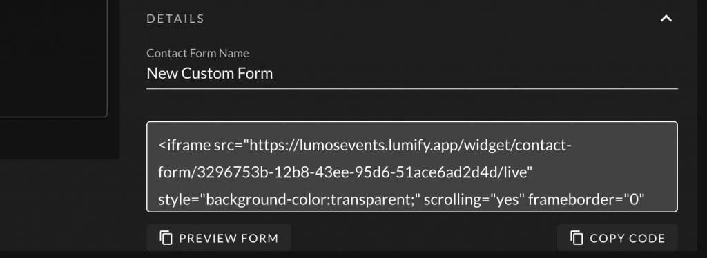
For the basic widget use, you can copy and paste the HTML code from the details section of the form generator.

Advanced Contact Form Integration
If you want to re-use an existing form on your website that matches your styling, you can use the Lumify Contact Form SDK instead of embedding the default <iframe> element on your website. See Using the Contact Form SDK for more information.